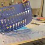
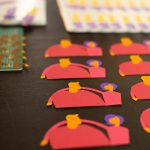
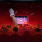
Kicking off with an upbeat combo of percussion and jazz guitar, the new ident for Picturehouse Cinemas is a textured, mulit-layered paper cut-out piece handcrafted by Picturesmith studio to coincide with the UK movie house’s new branding. “The brief,” producer Lisa Ramberg told us, “was to create a story that reflects the Picturehouse experience, including its customers, offerings and screenings.
“With the animation playing before every film, maintaining interest with repeat viewings was fundamental to the design,” Ramberg continued. “We used split screens to add detail, with up to five shots running at the same time. We also sneaked in some well-known film characters and a few more subtle film references.
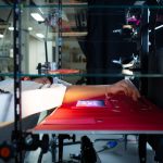
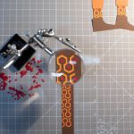
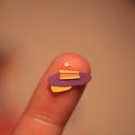
“The project was a real team effort, taking around three months to deliver. The animation had to be created in 2D to work out the movement of every asset initially. Then we brought the animation to life in stop motion, shooting thousands of hand-finished replacement assets on a multi-plane. Creating the 17 separate scenes from paper was a time consuming job, with some characters requiring up to 90 replacements, each consisting of up to five elements. As each scene was shot at different scale there were a lot of calculations to be done.”
Ramberg told us that lighting was another challenge, as they were shooting on a four-tier multi-plane for first time. She credits, “Our fantastic Director of photography, Peter Ellmore, for working his magic to create the overall look.”
For more insights into how the team achieved that overall look, see these behind the scenes videos and pics:

